Aug 25, 2022
Experiments with Astro and the Shared Element Transition API
Earlier this year, the Google Chrome team announced a new and exciting API for simple and buttery-smooth transitions on the web: the Shared Element Transition API (2022 edition). If you haven’t seen Jake Archibald’s presentation at Google I/O, I highly recommend you take a few minutes to watch that first—it’s very exciting.
There is a lot to like about this new API: it has a simple interface, it is extremely flexible, and the transitions are fully customizable via CSS animations. Being an experimental API, these things are subject to change, but in the current version things are looking really good! However, one limitation of its current implementation is that it only works with single-page applications (SPAs). Multi page application (MPA) support is in the plans, but at the moment, the Shared Element Transition API will not work on websites that require full page loads for navigation.
Waiting for MPA support is definitely an option. But if you’re nearly as impatient as I am, you’d probably want to take it for a spin on your server-side rendered applications as soon as possible. This article explores how we can do just that.
TLDR
I’ve built a simple Movie Database website to demonstrate some of the features of this new API. If you want to jump straight to the action, you’ll find the links to the live demo and GitHub repos below.
IMPORTANT: the Shared Element Transition API is currently behind the
chrome://flags/#document-transition feature flag in Chrome 104+ (the latest
version at the time of writing), so make sure you enable this flag before
taking the demo for a spin.
- GitHub Repo: https://github.com/Charca/astro-movies
- Live Demo: https://astro-movies.netlify.app/
Example Astro application using the Shared Element Transition API.
Let’s dive in!
A Faux SPA
Our starting point is a server-side rendered MPA Or as we used to call them in the 1990s, a website. built with Astro. I’ll come back to why we’re using Astro specifically in a moment, but for now, you can think of our application as a traditional website with two pages. Navigating from one page to the next generates an entire new page on the server, and the browser performs a full page load to display it.
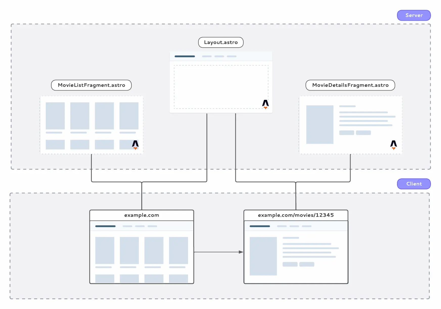
As I mentioned in the introduction, the Shared Element Transition API only works with SPAs at the moment. So to make it work with our website, we need to give our MPA two super-powers that are typically reserved for client-side rendered applications:
- A way to intercept navigation requests, and
- A way to update a piece of the DOM with the markup from the next page.
Traditional client-side routers make use of the History API to handle #1, but on Chrome-based browsers We can take advantage of the fact that we’re building an experience for Chrome only. In browsers that don’t support the Navigation API, our website will work as a regular MPA. we have access to the much better suited Navigation API for intercepting navigation requests.
You can think of the Navigation API as the evolution of the History API. It not only let us intercept navigation requests, but it also provides features to handle scrolling and focus automatically, aborting requests, improved accessibility, and much more.
Here’s the code we need to add to our website to make it work with the Naviation API:
navigation.addEventListener('navigate', (navigateEvent) => {
  const url = new URL(navigateEvent.destination.url)

  if (url.pathname.startsWith('/movies/')) {
    navigateEvent.intercept({
      async handler() {
        const html = await getHTMLFragment(url.pathname)
        updateTheDOMSomehow(html)
      },
    })
  }
})
The getHTMLFragment and updateTheDOMSomehow functions in the example above are what we need to implement to support #2 in our SPA wishlist. As you might have guessed from their names, these functions are going to fetch a fragment of HTML from a server somewhere, and then update a piece of the DOM with the new data. This is where Astro comes in.
HTML, Please
Astro is an exciting and relatively new framework for building websites that are fast from the start. It ships zero runtime JavaScript by default, but we can opt-in for interactivity on the parts of the page that need it (through a pattern known as Component Islands).
On top of that, Astro sites can use components built with React, Vue, Svelte, Solid, and other UI frameworks. So we get the nice developer experience we’re used to, without having to compromise on performance. In the humble opinion of this front-end developer, Astro is the closest thing to having our cake and eat it.
But the main reason Astro is a perfect fit for our little experiment is that Astro components are not built using JavaScript as their primitive language, they’re built on top of HTML. For the website we’re building, this means that the HTML fragments that we need to update the DOM are just regular Astro components. I should mention that Astro is not the only framework that works this way. You could accomplish something similar using Eleventy, for example.
All we have to do is place our fragments inside of the pages/ folder. Once we do that, we can request their contents via a fetch call. The response will be a block of HTML which we can drop into a DOM element using the innerHTML attribute.
The implementation of our client-side UI framework then becomes quite simple:
async function getHTMLFragment(pathname) {
  const response = await fetch(`/fragment${pathname}`)
  return await response.text()
}

function updateTheDOMSomehow(html) {
  document.getElementById('content').innerHTML = html
}
Here’s the updated design of our application, and a recap of what we did so far.
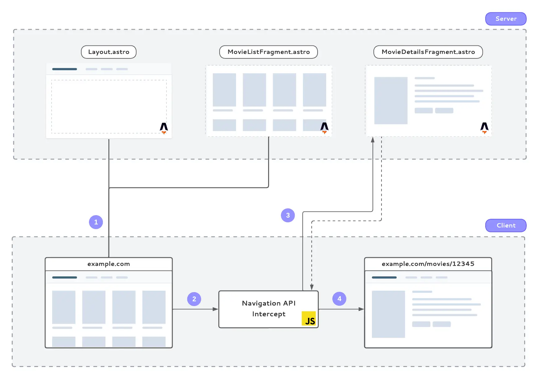
- Nothing changes for the initial request. The page is rendered on the server and displayed on the browser like a traditional MPA request.
- When a user performs a navigation request (i.e. they click on a link), the Navigation API intercepts the event and decides whether to let it go through to the server, or handle things on the client.
- If we’re handling things on the client, we then make a
fetchrequest to get a rendered fragment from the server. The server responds with a piece of HTML. - Finally, we use that piece of HTML to update the DOM. All subsequent navigations (including going back and forward with the browser buttons) are handled in the exact same way.
Now for the fun part!
Making Things Move
We now have a quote-unquote SPA in our hands, so we can finally start implementing those eye-catching transitions using the Shared Element Transition API.
Getting a basic transition animation on the page only requires a few changes to our navigation intercept handler:
navigateEvent.intercept({
  async handler() {
    const html = await getHTMLFragment(url.pathname)

    // If the browser doesn't support this API, update the DOM as usual
    if (!document.createDocumentTransition) {
      updateTheDOMSomehow(html)
      return
    }

    // Otherwise, update the DOM within a transition
    const transition = document.createDocumentTransition()
    transition.start(() => updateTheDOMSomehow(html))
  },
})
With that, we’ll get the default fade-out/fade-in animation, which looks something like this:
Default fade in/out animation using the Shared Element Transition API.
Here’s roughly how this works: when we call the transition.start() method, Chrome will capture a screenshot of the current state of the page before we make any updates to it. The screenshot will sit on top of the page, so we can update the DOM underneath without losing reference of how the UI used to look like.
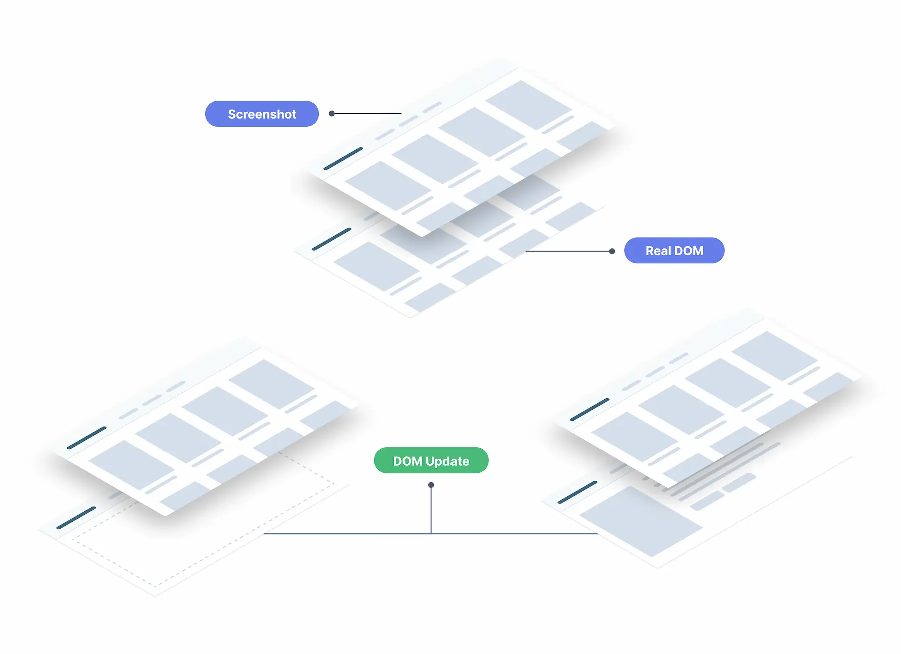
After updating the DOM with the new HTML fragment, Chrome will take another screenshot, this time representing the state of the page after the updates. The transition animation now happens between the two screenshots: one will animate in, the other will animate out. Once the animation is done, both screenshots will go away, revealing the real DOM once again.
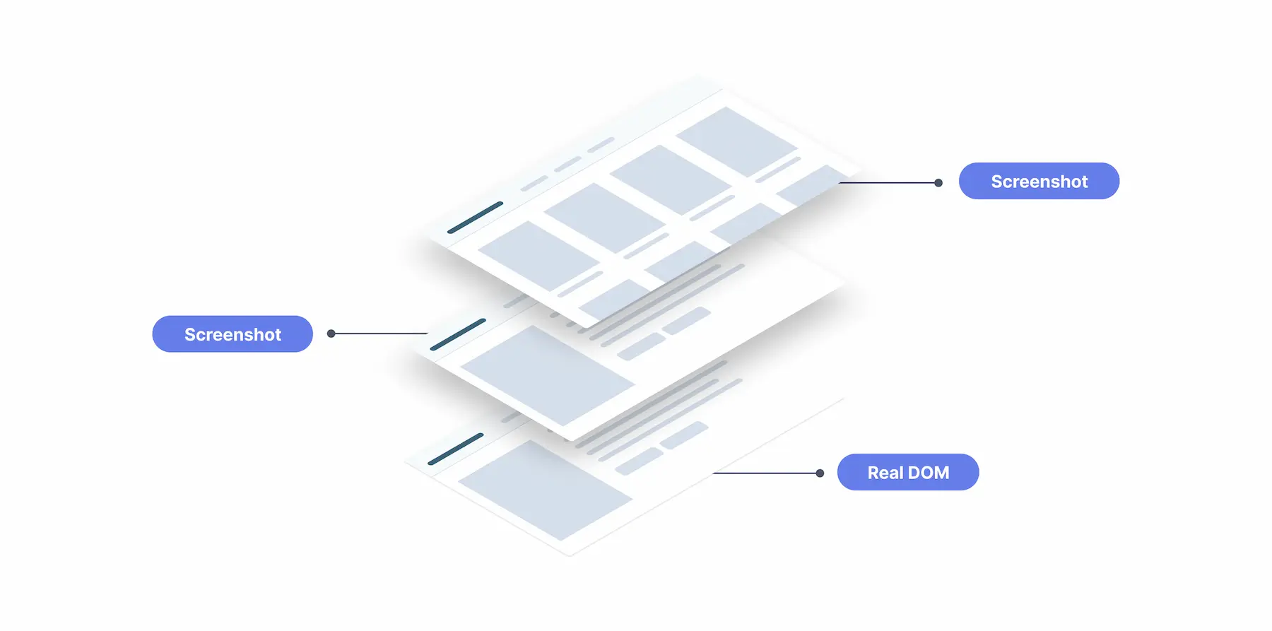
By default, the API gives a transition-tag-name of root to the HTML document, which we can target via CSS to customize the animation. We can use the ::page-transition-outgoing-image and ::page-transition-incoming-image pseudo-elements to target the screenshot taken before and after the DOM updates, respectively.
@keyframes fade-in {
  from {
    opacity: 0;
  }
}

@keyframes fade-out {
  to {
    opacity: 0;
  }
}

@keyframes slide-from-right {
  from {
    transform: translateX(30px);
  }
}

@keyframes slide-to-left {
  to {
    transform: translateX(-30px);
  }
}

::page-transition-outgoing-image(root) {
  animation: 90ms cubic-bezier(0.4, 0, 1, 1) both fade-out, 300ms cubic-bezier(
        0.4,
        0,
        0.2,
        1
      ) both slide-to-left;
}

::page-transition-incoming-image(root) {
  animation: 210ms cubic-bezier(0, 0, 0.2, 1) 90ms both fade-in, 300ms
      cubic-bezier(0.4, 0, 0.2, 1) both slide-from-right;
}
With these styles applied, the animation will now look something like this:
If we want certain parts of the page to animate independently, we can give certain elements a different transition tag name. In our demo, we can use this to prevent the header from sliding in and out with the rest of the page (which doesn’t look very good), and to simulate the “expand” animation between a thumbnail and a movie poster.
By giving an element its own transition tag name, Chrome will cut a separate screenshot for it so that it can be transitioned with a different animation than the rest of the page.
We can do this via CSS:
.movie-poster {
  page-transition-tag: movie-poster;
  contain: paint;
}
Or with JavaScript:
moviePosterEl.style.pageTransitionTag = 'movie-poster'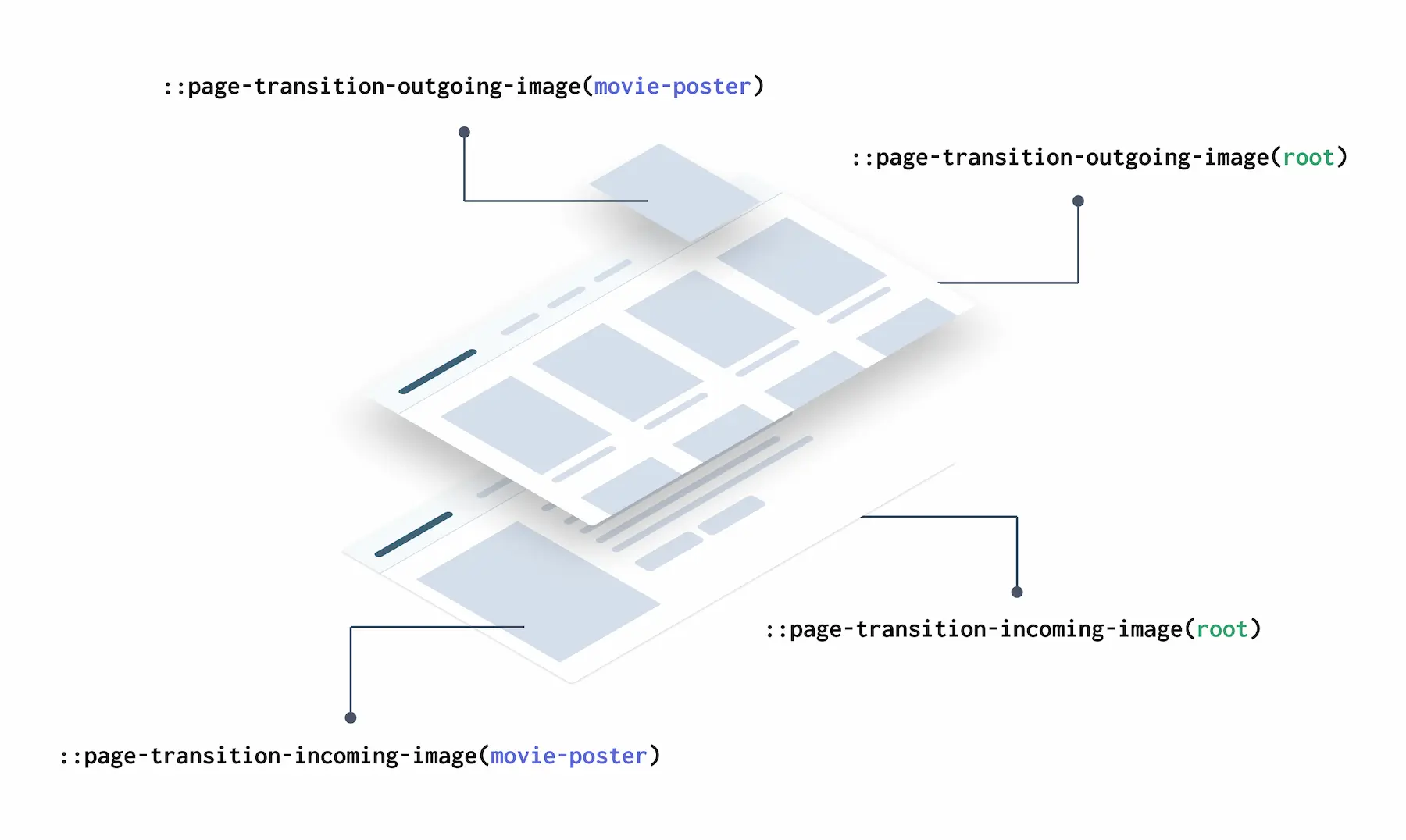
Now, if an element on the outgoing page has the same transition tag as an element on the incoming page, Chrome will treat those as the same element and will smoothly transition between them. The API animates the position and size of the elements by default, so we get the expand effect essentially for free.
One thing to keep in mind here is that only one element on the page can have a particular transition tag. For our movie poster example, this means that we need to first find the thumbnail that corresponds to the full-size movie poster on the movie details page, and then apply the transition tag programmatically.
async handler() {
    // ...
    const thumbnail = document.getElementById(`movie-poster-${movieId}`)

    // If the thumbnail of the movie we're navigating to exists
    // on the current page, assign it the correspoding tag name
    if (thumbnail) {
        thumbnail.style.pageTransitionTag = 'movie-poster'
    }

    transition.start(() => {
        // Remove the tag once the transition starts
        // (i.e. the screenshot was taken)
        if (thumbnail) {
            thumbnail.style.pageTransitionTag = ''
        }

        updateTheDOMSomehow(html)
    })
}
And with that, we get to the final form of our transition. The root elements transitioning with a fade and slide animation, the header stays put, and the movie-poster elements zooming into their respective counterparts.
Final transition, with different elements on the page transitioning independently.
We’ve only covered the basics of the API in this section, and we’ve only implemented a single transition going in one direction. Depending on your application, this might be all that you need, but if you’re looking for more customization options, the API will have you covered. I recommend reading the article on the Chrome Developers’ blog and checking out the various demos there for more information.
Room For Improvement
If you’ve been playing with the live demo for longer than a few seconds, you might have noticed certain things that could be optimized to handle more “real-world” scenarios. These issues are not really specific to our application, of course. Traditional SPAs will face similar challenges when it comes to handling latency and race conditions between transitions. Those optimization are outside of the scope of our little demo, but I thought it would be useful to drop a quick note about them here.
1. Latency
The number 1 issue with our implementation is that we’re not doing anything to handle latency. Requesting a fragment of HTML is typically super fast, but like with any other network request, the UI should be able to handle slow responses while keeping the smooth transitions.
Prefetching and caching assets helps a lot here. But for a more general solution, we could tackle this problem the same way traditional SPAs and native apps do: update the UI right away with a placeholder that looks like the page we’re about to load, and once the data comes in, we can replace the placeholder with the real document.
This adds a level of complexity, of course. Each page would need to hold a placeholder (probably within a <template> HTML element) of each other page it could transition to, which can become unmanageable for larger applications. There is a chance this could be automated in some way by auto-generating the placeholders based on the real fragments, but again, it is not trivial work. Something else to experiment with, I guess :)
2. Race Conditions
If we navigate through multiple pages faster than the transitions can resolve, it is possible to end up in weird states where the current URL doesn’t match the page we’re looking at. In the demo, you can reproduce this by navigating a few pages in, and then spamming the back button as fast as you can.
This is a hard problem to solve because it’s a conflict between two independent behaviors working as designed: URLs update instantly, while transition animations–by their very definition–take some time to resolve.
There are a couple of things that can help with this. The Navigation API provides a mechanism to abort a navigation request if it becomes redundant using an AbortSignal. This can help in cases where the user clicks on different links too quickly. For instance, click on Movie Poster 1, and before the page updates, click on Movie Poster 2. The first navigation request could be aborted in this case.
As for the transitions, the API provides a transition.abandon() method that can be used to jump directly to the final stage. This can help in the “user spamming the back button” scenario.
I should probably also note that, even with these methods, it would be challenging to solve 100% of all of the possible race conditions users could run into. Hopefully, a future version of the API (maybe the MPA-supported version?) would provide better mechanism to handle these cases.
3. Dehydrated Islands
Astro Islands, which is the strategy used to hydrate only parts of the page rather than the whole thing, do not work correctly with our Astro-powered fragment approach. This is because the code that prepares the island for hydration is included on the original request, so if an island was not part of the first page to come from the server, it won’t hydrate appropriately when we render it as part of a client-side navigation event.
I know this is kind of a big deal (after all, partial hydration is one of the big benefits of Astro), but I’m pretty sure this is a solvable problem. I will reach out to the experts on the Astro Discord channel to find out ways to tackle this, and will update the article once I have more info.
SPA vs SPA
You might be wondering at this point why we went through the trouble of transforming an Astro MPA into a (sort-of) SPA just so that we could use the Transitions API. Shouldn’t we just have used an SPA to start with?
That is a fair question, but there are a few key differences between our solution and a traditional SPA:
- Rendering happens entirely on the server (or during build time, in the case of SSG) as opposed to the client. There is no need for the client to keep any sort of state, event handling, Virtual DOMs, or any of the things UI frameworks typically do.
- Client-side routing and animations are handled by the browser’s API, so we don’t need to ship a JavaScript library or framework to the client to handle this for us. Also, unlike traditional SPA routers, using the Navigation API to intercept route changes does not require you to wrap your entire application in it, which means that…
- There is no hydration needed! Which, I know it sounds obvious since we’re not shipping any framework JS, but it’s still a key distinction between our SSR approach and a traditional SPA.
This isn’t to say that our “false SPA” solution is necessarily better than a traditional SPA. It is faster, yes, but it’s also doing a lot less. If your app requires very frequent UI updates, you will probably better off with a client-side rendered application.
Conclusion
The Shared Element Transition API is a huge win for SPAs and MPAs alike. SPAs have always had methods for transitioning between pages, but they’re now able to do so shipping a lot less JavaScript to client devices. Additionally, they can now rely on the browser to do the heavy-lifting as opposed to a third-party library that would probably clog the main thread.
As for MPAs, when the API officially supports them, they will have a way to do something that is currently impossible: transitioning between server-side rendered pages without using any JavaScript.
Using the Navigation API along with Astro-powered HTML fragments is a powerful combination. This isn’t a revolutionary approach, of course. Livewire and Hotwire are solutions on the Laravel and Rails communities that use a similar strategy with a much more robust framework. If we’re lucky, someone would bring these innovations to the JavaScript space and create a nice abstraction around it.
I encourage you to experiment with these methods and the Shared Element Transition API on your projects as well. If you have any feedback, please make sure you let the Chrome team know about it. In the end, we will all benefit from it.
Thank you for reading~
Special thanks to Ben Myers and Chantastic for reviewing a draft of this article, and to Andre Madarang for open-sourcing his Laravel + Tailwind Movies App which was used for the UI of the demo.